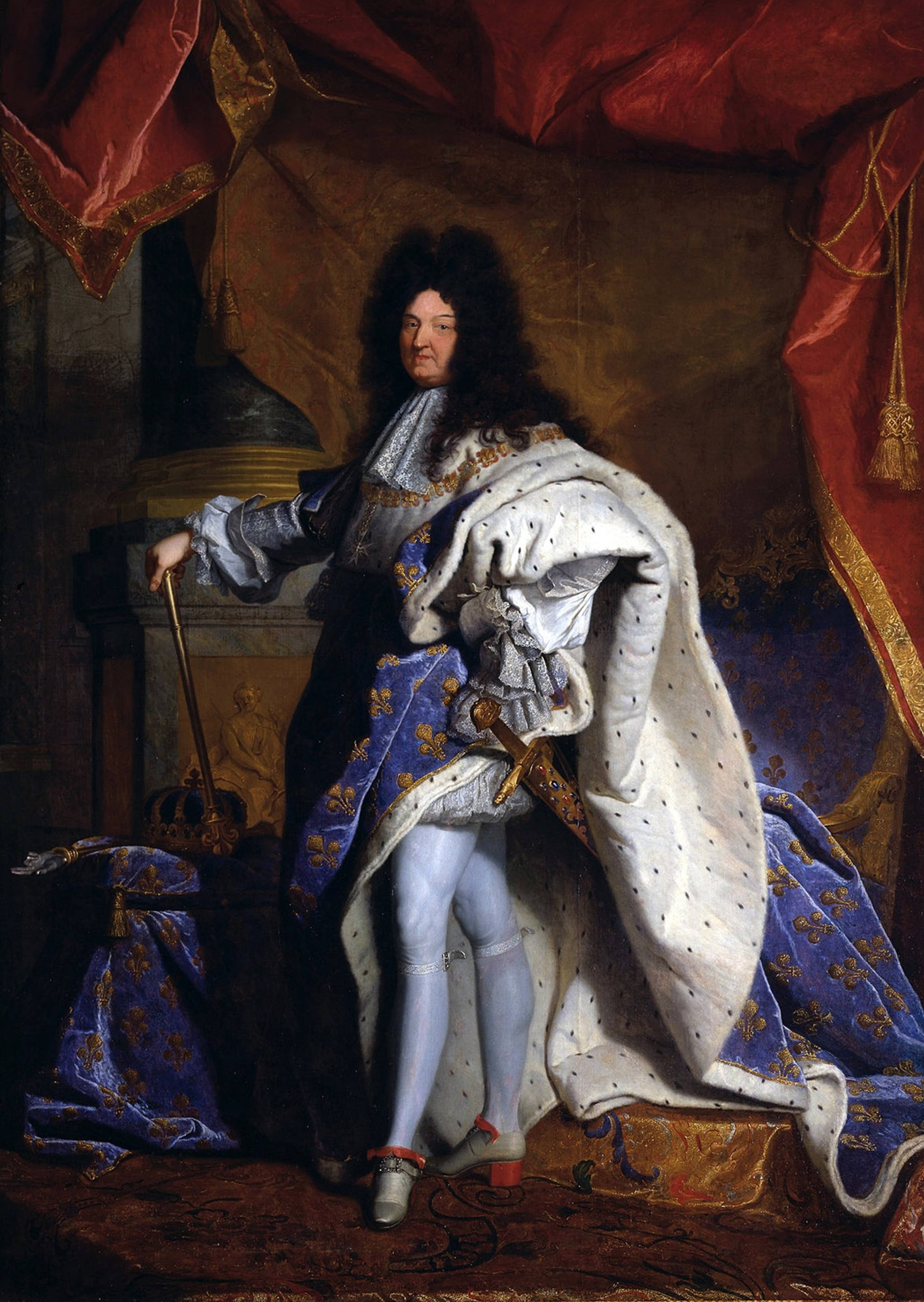
When lilacs are bred out of the dead land at the end of the Anthropocene, we will enter what artist Isabella Streffen calls the Lilacene. It will have bisexual lighting, the kind I recently saw in Kettle’s Yard gallery, Cambridge, UK, illuminating Tarek Lakhrrisi’s Unfinished Sentence (2019) – which is part of the show “Here is a Gale Warning: Art, Crisis & Survival.” Lakhrrisi’s work references the French writer, Monique Wittig’s 1969 novel Les Guérillères, an experiment in de-patriarchalized language used to depict a post-Anthropocene, feminist lesbian society. How has purple – a color that, from the Roman Empire on, has been associated with history’s winners – become the color of survival?
If “royal” is the purple that can easily be recognized and defined, there’s a range of different purples I don’t quite know how to name, that multiplied in the 19th century when newly invented chemical dyes allowed a greater range of colors to be fixed. And so many of them were purples: heliotrope, puce, mauve… “Mauvine” was invented by chemist William Henry Perkin in 1856. It was the first commercially reproducible synthetic dye, turning a color that had been the most difficult and expensive to produce due to its laborious extraction from the shells of murex sea snails, into the most reliable and cheapest.
Hyacinthe Rigaud, Louis XIV, 1701. Oil on canvas, 355 x 235 cm. Courtesy: Musée du Louvre, Paris
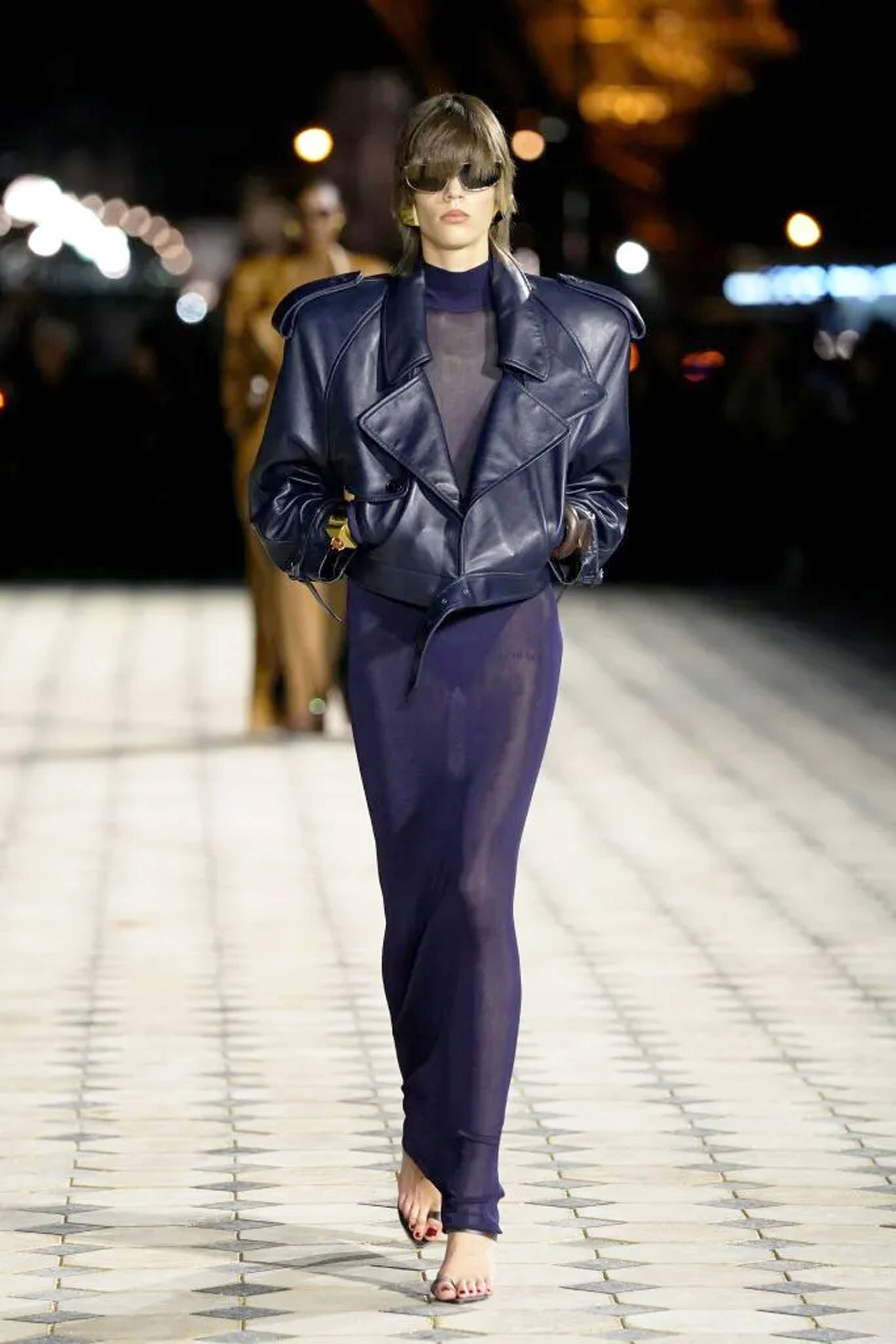
Khaite FW24. Photo: Catherine Holstein
Anything that proliferates is ripe for re-signification. Purple’s new multiplication and availability made it available for a range of cultural re-interpretations. It’s a color that might be best interpreted via what US affect theorist Eve Kosofsky Sedgwick called “weak theory,” whose indefinability is its strength. Described by fellow-critic Kathleen Stewart as: “Theory that comes unstuck from its own line of thought to follow the objects it encounters, or becomes undone by its attention to things that don’t just add up but take on a life of their own as problems for thought.” What couldn’t quite be pinned down – the lavender produced between masculine blue and feminine pink – became shorthand for queer.
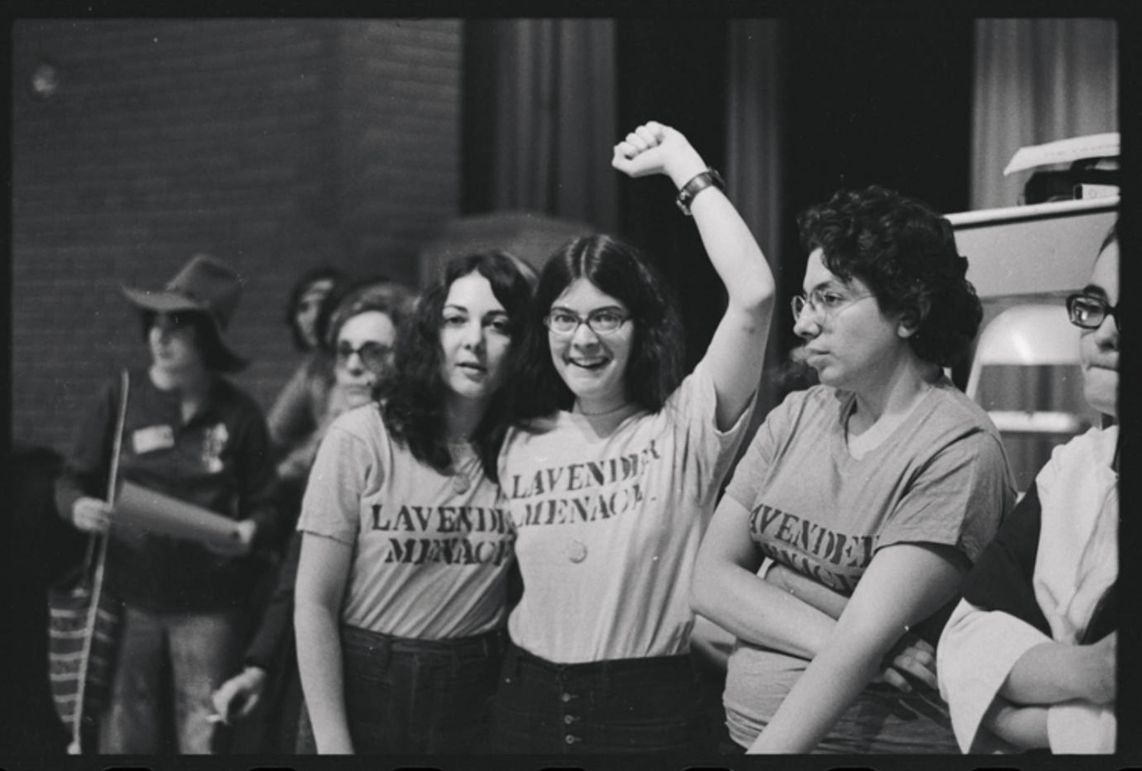
The history of queer purple has been one of reclamation of the term as an insult, and the color comes with knowledge of its two-sidedness inbuilt. During the “Lavender Scare” in the mid-20th century US – a McCarthyite campaign that ousted LGBTQ+ worker from government jobs, ostensibly for their perceived communist sympathies – the “Purple Pamphlet,” an anti-gay leaflet featuring explicit photographs, priced at 25¢, became a bestseller at a Washington gay bookshop where it sold for 2$ a copy. By the time the “Lavender Menace” group – who named themselves for feminist writer Betty Friedan’s slur against lesbians – wore purple T-shirts to protest for equality and representation at theSecond Congress to Unite Women in New York in May 1970, the color had become a symbol of resistance.
Members of the Lavender Menace stand defiant at the Second Congress to Unite Women, May 1, 1970. Photo: Diana Davies. Courtesy: Manuscript and Archives Division, The New York Public Library
“Future Dusk” was widely predicted as the 2025 Pantone Color of the Year. It’s a tone somewhere between indigo and puce, just as twilight is somewhere between – as the French say – chien et loup (dog and wolf). Forbes called the shade “ageless” and “non-binary.” Consumer trend forecaster WGSN predicted it would channel “escapism, and feeds into themes of transition – whether it be moving from dark to light, or dusk to dawn – making it perfect for a period of immense change.”
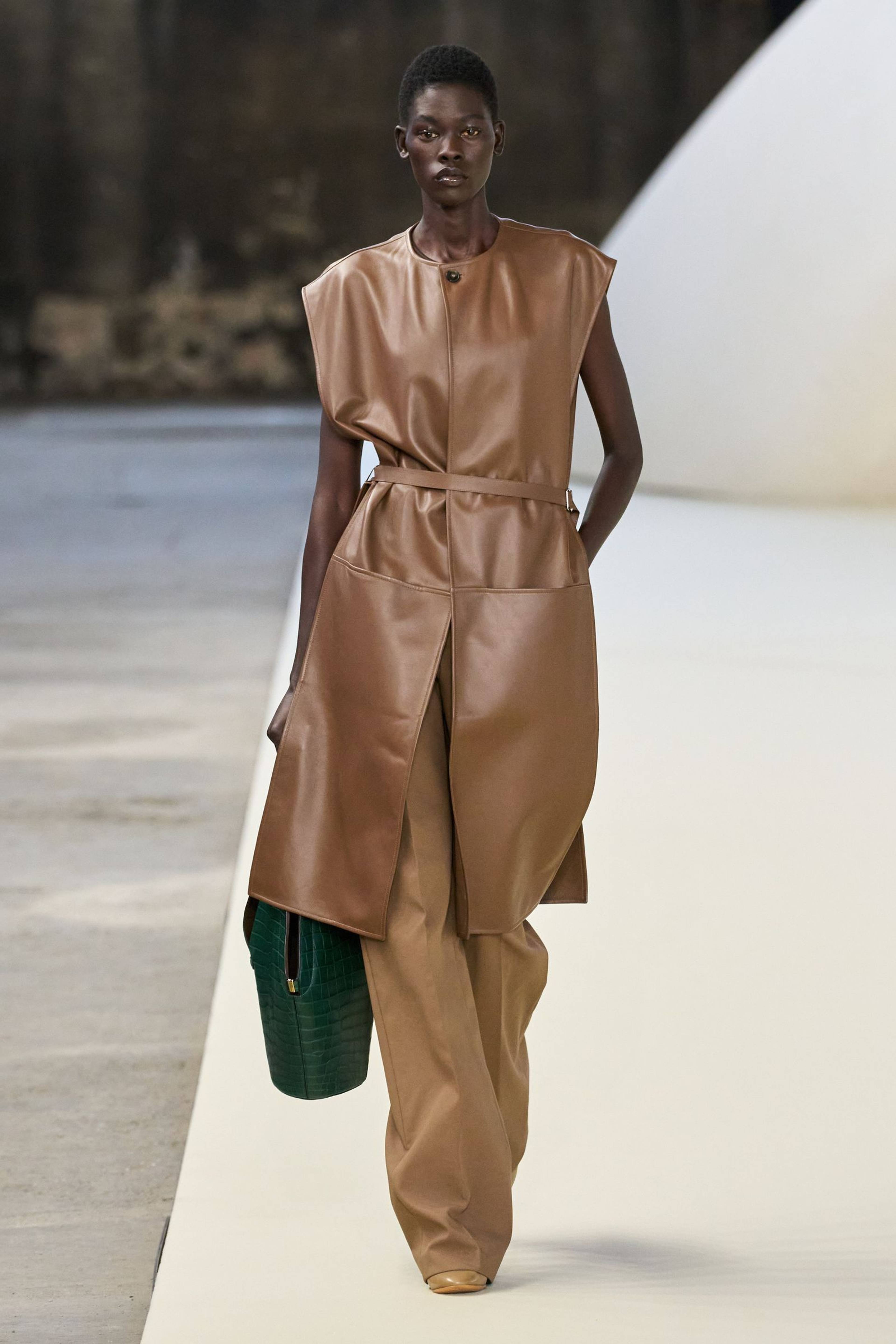
Many fashion sites, last year, claimed Future Dusk as the Pantone shoo-in, until it was overtaken in the final stretch by meh “Mocha Mousse,” a conservative beige-brown greeted on Reddit’s crafting forums as “Dictator Doodoo or Recession Beige.” WGSN, who claim a 90% accuracy rate, preemptively announced Future Dusk as their 2025 color of the year as far back as 2023, when a number of designers were already using it. Why did Mocha Mousse win where Future Dusk failed?
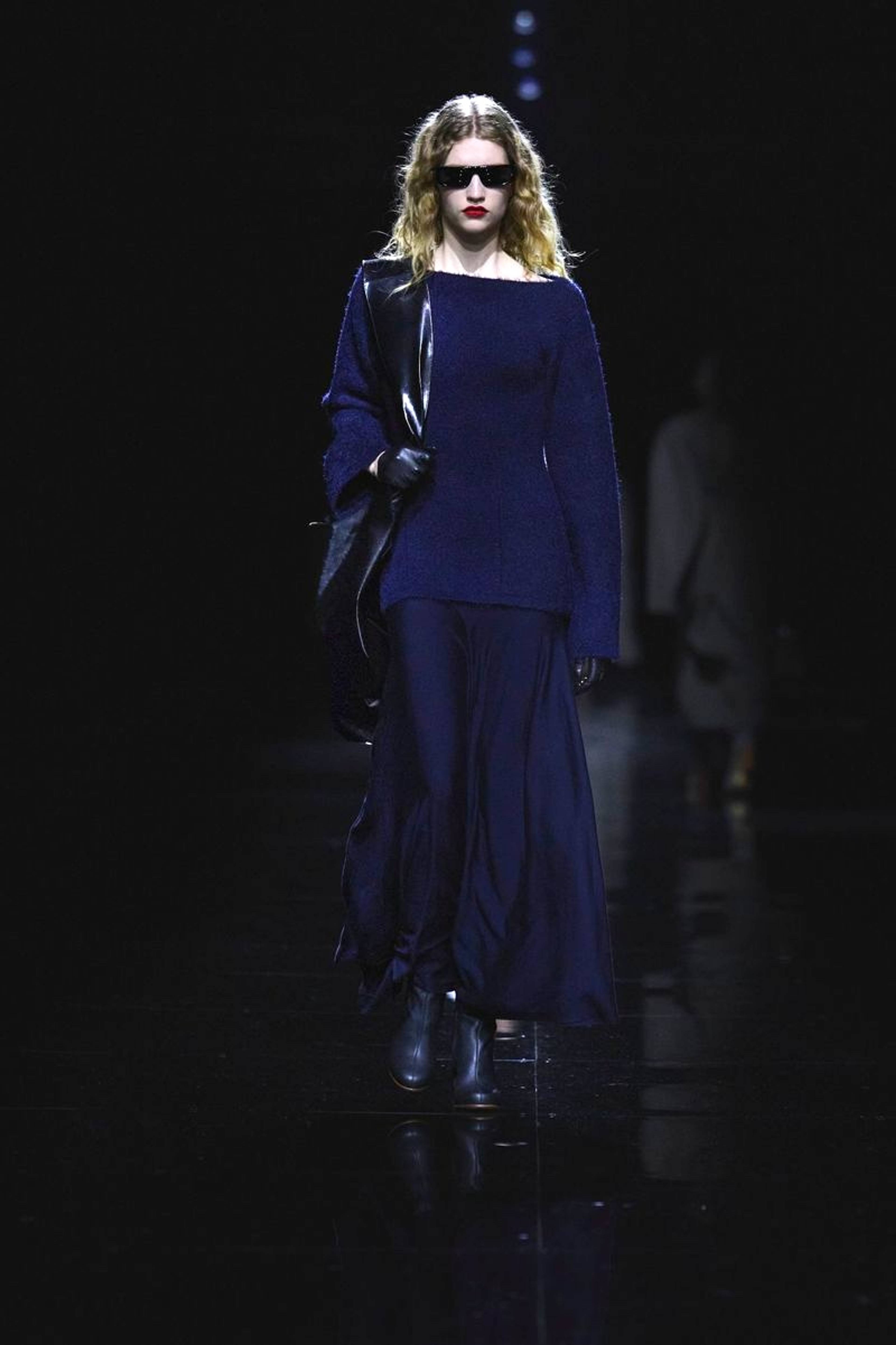
Tod’s SS25
If Mocha Mousse represents one kind of indeterminacy – nostalgic, inoffensive, bland – Future Dusk is entirely another. After years of neutrals, purple is “not necessarily an easy color to style,” as InStyle magazine wrote in March 25. Is it difficult because of its refusal to be defined?
Fashion, of course, participates in both hegemonization and liberation. It is both what’s sold to us and what creatively escapes or détournes a strictly commercial environment. In the current polycrisis, a refusal to be defined is going to come in handy. Like lavender, Future Dusk is a color that hovers “between” two others, but its deep tone ensures that it retains its links to splendor. Future Dusk is splendor as indeterminacy, or the splendor of indeterminacy. As dusk, not dawn, it’s also a sign of something ending.
Welcome to the Lilacene.
___


